

Why dark plastics need a different print approach
On black, charcoal, navy and other dark moulded parts, the eye works harder to pick out fine lettering and symbols. A mark that looks crisp on white ABS may disappear or feel weak on a dark housing if the ink film is too thin or the type is too small.
That is why pad printing on medical and electronic components is never just a matter of pressing ink onto a part. The pad has to pick up the right amount of ink, transfer it cleanly, and leave enough coverage for the colour to stand off against the substrate. If the component has a slight texture, a curve, or a recessed area, those factors also influence how much detail can be held.
For manufacturers in Pinetown, Durban and the wider South African market, this matters on items like control panels, handheld devices, housings and clip-on covers. A clear mark helps operators, service teams and end users read identifiers without straining their eyes.
Contrast starts with the right colour choice
Contrast is the first thing to get right. On dark parts, white is the most common choice because it gives the strongest visual break, but other light shades can also work if they sit cleanly on the surface. In some cases, a softer grey may be acceptable for low-contrast branding, though it will never read as strongly as a bright light ink.
The surface itself also affects contrast. A glossy black part can make a mark seem sharper than a textured one, while a satin finish can reduce glare and improve visibility under factory lighting. If the part is handled in hospitals, labs or production lines with mixed light, it is worth checking the print under real conditions, not only under a bright bench lamp.
- Choose a high-contrast ink colour first, then refine the shade from there.
- Check the finished mark under indoor light, daylight and shaded conditions.
- Allow for wear, cleaning and repeated handling when selecting the final colour.
In Durban’s humid air, surface preparation also becomes more important. Any trace of mould release, dust or oil can affect both adhesion and appearance, so the part should be cleaned properly before sample printing.
Ink opacity decides whether the mark holds its shape
Opacity is the amount of coverage the ink gives over the substrate. On dark plastics, a weak ink can look washed out, especially on small type or thin lines. A good pad printing setup aims for a clean solid mark without flooding fine detail.
Ink selection has to suit the part material, the intended handling and the curing method. Some plastics need stronger surface treatment or a more careful ink choice to help the print bond properly. If the mark must survive repeated wiping, alcohol based cleaning or general industrial handling, the print system needs to be tested before full production.
Printed information on medical and electronic parts is often functional as well as visual. Part codes, icons, channel labels and user instructions must remain readable after curing, packing and transport. That is where trial samples are useful, because they show whether the ink is sitting on the surface properly or whether the coverage needs adjustment.
- Use ink matched to the part material and expected handling.
- Check for full coverage on the first pass, not after the job is complete.
- Test adhesion and legibility together, because a print can look good but fail in use.
Image size and line weight cannot be too fine
Small artwork is where many dark-part jobs go wrong. Fine text, thin borders and tiny symbols can fill in or break up, especially if the pad shape does not support the area well. The smaller the print, the more careful the setup must be.
If the original artwork is drawn too fine, it may need to be redrawn for pad printing. That does not mean changing the message, only making the mark printable. Letters can be opened up slightly, line weights can be strengthened, and spacing can be improved so the result stays legible after transfer and curing.
At PadPrinters Medical in Westmead, Pinetown, this often comes up on electronics housings and medical device parts where the logo, serial detail or instruction text must fit into a tight print area. A good rule is to design for the part, not for a screen mock-up. What looks neat on paper may be too delicate for a curved plastic cover.
- Keep small text bold enough to survive ink transfer.
- Avoid overcrowding the print area with too many elements.
- Use wider spacing around symbols and critical information.
Curves, texture and fixture control affect readability
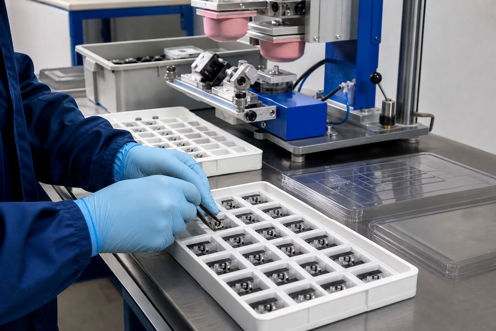
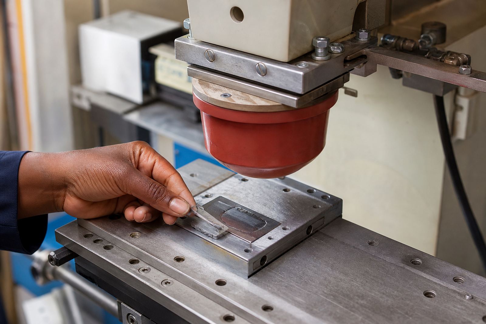
Even if the ink and artwork are correct, the print can suffer if the part moves during transfer or sits at the wrong angle. Fixtures help hold the component consistently so the image lands where it should. This is especially useful for repeat jobs where the same marking must sit in the same position every time.
Curved and stepped surfaces can distort the image slightly, so the setup must account for that from the start. A flat artwork file may need minor changes to print cleanly on a rounded surface. Where necessary, the print area can be planned to avoid the steepest curve or the roughest texture.
Production teams in Johannesburg, Pretoria, Cape Town and Gqeberha often need repeatability across batches, not just a good one-off sample. Rerun job control matters here because the same part should read the same way in every batch, even when production is split over time.
- Use fixtures to keep the part stable and aligned.
- Plan the print area around curves and moulded details.
- Keep sample approval records so later batches match the approved mark.
Curing and handling can make or break the final result
After the print is transferred, it still needs to cure properly. If the cure is too light, the mark may smudge, pick up dust or lose opacity when handled. If it is too aggressive, the ink can discolour or the part can be affected, depending on the substrate and process.
If curing depends on stable timing or controlled heat, interruptions can affect consistency, so the job needs a process that can be managed cleanly during power fluctuations. That is one reason trial runs and process control matter before a full production release.
Cured prints on medical and electronic parts must be checked not only for appearance but for practical use. The mark should be readable after packing, movement and normal factory handling. Customers remain responsible for their own device compliance, so the print process should support their specification, not replace it.
From the print room: The Durban side of the work
Consider a black electronic enclosure being supplied from a manufacturer in Pinetown to sites in Durban and Johannesburg. The label needs a logo, a part reference and a small directional mark. If the text is too fine, it disappears. If the white ink is too thin, the black substrate shows through. If the part is not held correctly, the mark lands crooked and looks unprofessional.
The better approach is straightforward: redraw the artwork for printability, choose an opaque ink, test the adhesion on samples, and adjust the fixture before the full run. That process saves time and avoids rework later. It is especially useful when the same part has to be supplied to multiple branches or sites, because the final mark needs to stay clear from the first unit to the last.
In practice, readability on dark parts comes down to three things: strong contrast, enough ink coverage and an image size that suits the process. Get those right, and the mark holds up in the real world, not only on the sample sheet.