
Why artwork matters before the first print cycle
Pad printing moves ink from an etched plate onto a silicone pad, then onto a curved, recessed or uneven part. That process can only carry so much detail, so the original artwork has to be suited to the print area from the start. When logos, symbols or text are supplied too small, too thin or out of proportion, the result is usually soft edges, broken strokes or fills that close up after curing.
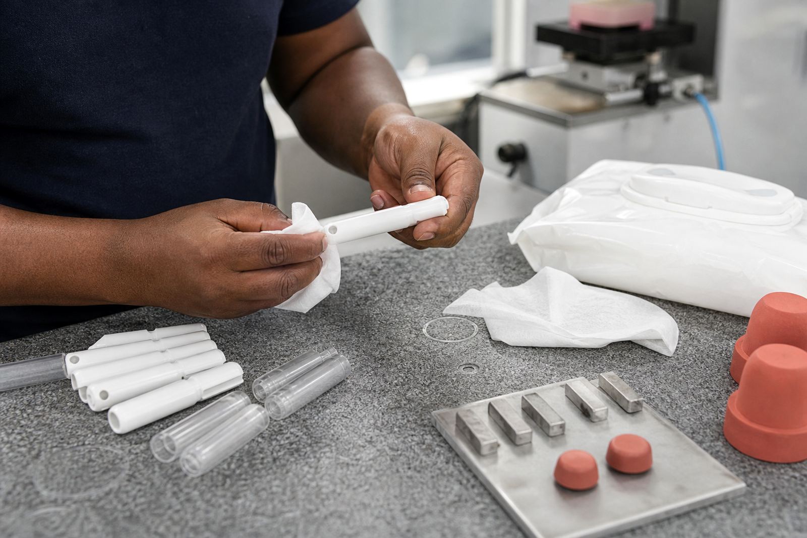
In medical and electronic work, the artwork is often as important as the material choice. A switch cap, housing, syringe component or control panel face may look simple, but it can have tight radii, limited flat space and strict placement needs. If the artwork does not respect those limits, the printer ends up fighting the job instead of controlling it.
At our Westmead, Pinetown base, we often see files that were prepared for screen printing or general digital use and then sent for pad printing without adjustment. That is where the trouble starts. The same artwork may look fine on a monitor but fail once it is reduced to a few millimetres on a part surface.
Fine gaps and weak line weights are the first problem
Very fine gaps between letters, icons or technical symbols are one of the most common mistakes. In pad printing, those gaps can close when the silicone pad picks up and releases the ink, especially if the artwork is too dense for the part size. Small open areas can also disappear after curing if the ink film is heavier than expected.
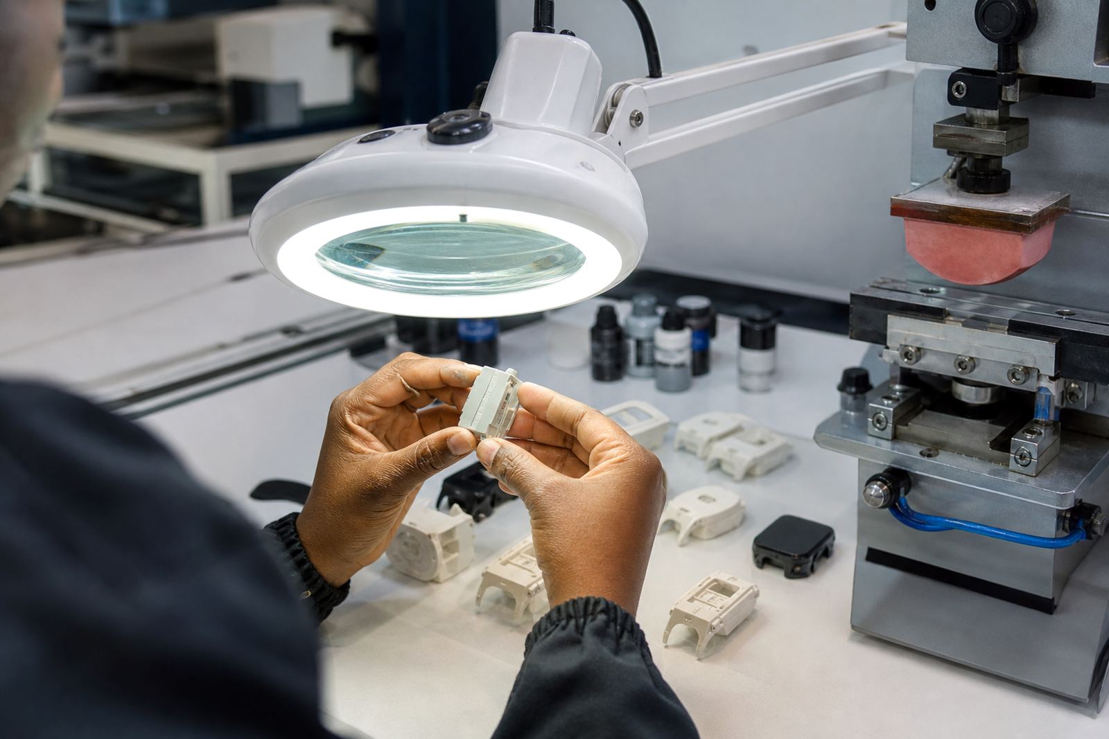
Weak line weights are just as risky. Thin strokes may break, especially on textured plastics, curved mouldings or parts that need a second pass. If the job is for a control face, medical marking or small electronics legend, it is better to build in a little more line strength than to try to save detail that the process will not hold cleanly.
- Keep small text readable at the actual print size, not only in the original artwork file.
- Avoid hairline elements unless the part, ink and fixture have already been tested.
- Leave enough space between fine details so the pad can transfer each element clearly.
Scaling errors that change the meaning of a mark
Poor scaling causes more than just an untidy print. On a component label or control marking, a symbol can become too narrow, a serial field can move off centre, or a logo can lose its balance and look unprofessional. On some parts, even a 1 mm shift can affect visibility around buttons, windows, connectors or moulded ribs.
Medical and electronics customers often need repeatable marks across different part sizes. That means the artwork must be adapted for the actual print face, not simply reduced in a generic way. When the image is stretched or compressed unevenly, circles become ovals, type loses spacing and any technical linework can look distorted.
We see this often with clients serving Durban, Johannesburg, Cape Town, Pretoria and Gqeberha. A file that works on one housing may fail on another version of the same family if the mould changes slightly. It is worth checking every size variant before production starts rather than trying to rescue it later.
Colour matching and curing need artwork that supports the process
Pad printing inks are selected for the substrate, the required finish and the curing method. Some jobs need air drying, others need heat curing or a longer handling time before packing. If the artwork has too much fine detail or too little contrast, colour matching can be harder to judge and the final mark may not sit clearly on the part.
For light parts, dark ink usually gives the best legibility. On dark or textured components, lighter marks need stronger contrast and often a cleaner edge in the plate. The artwork should be prepared with the final ink colour and curing behaviour in mind, not as an afterthought.
- Check contrast against the actual substrate colour, not only against a white screen background.
- Allow for the way cured ink can appear slightly different from wet ink.
- Use artwork that leaves room for adhesion testing and trial sample runs before full production.
Local production conditions can expose weak artwork fast
South African production conditions add another layer. In humid coastal areas around Durban and Pinetown, some substrates and inks behave differently than they do inland.
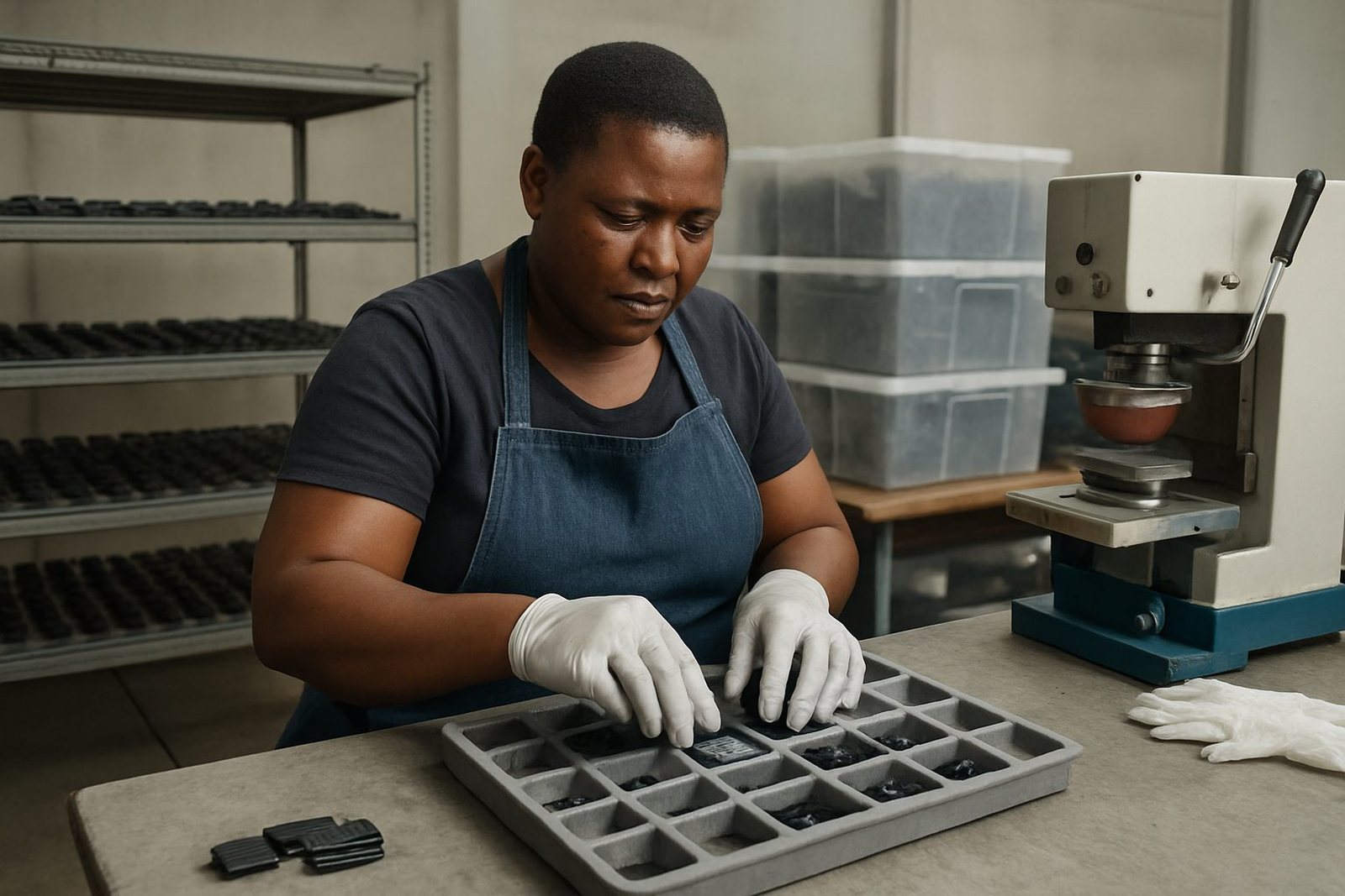
That is why artwork should be prepared with practical production in mind. A mark that looks acceptable in a file may still need adjustment for fixture alignment, plate exposure and repeat runs. When the artwork is sound, the setup team has a much better chance of keeping the job stable from the first sample to dispatch packing.
For manufacturers in New Germany, Westville and wider KwaZulu-Natal, this is often the difference between a smooth job and repeated rework. Good artwork reduces pressure on the press operator and gives quality checks a clearer standard to work from.
What to check before sending artwork for pad printing
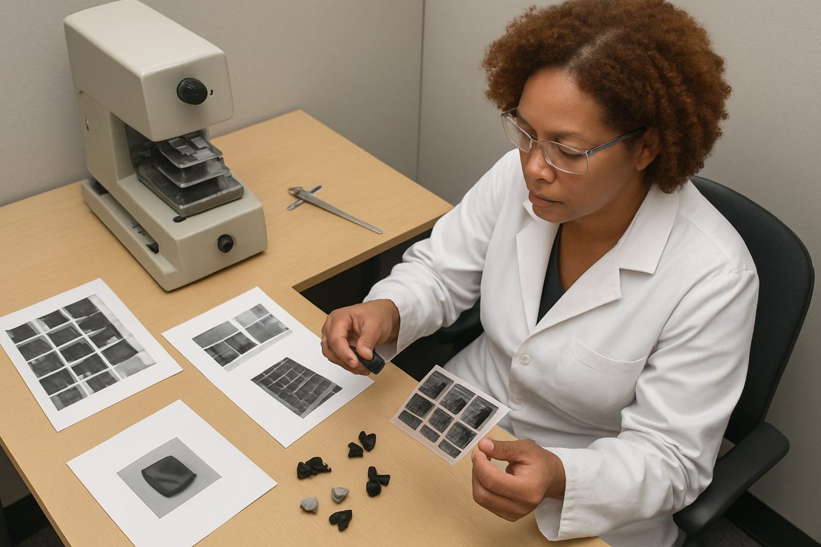
A proper artwork review does not have to be complicated. It does need care. The goal is to catch the issues that cause poor transfer, weak readability or unnecessary job delays. Once the print plate is made, changes are slower and costlier to correct.
- Confirm the final print size on the actual component, not only on a drawing.
- Check that small text, logos and symbols remain readable after scaling.
- Make sure line weights are strong enough for the chosen substrate and ink.
- Allow proper spacing around fine details and near edges or curves.
- Plan for curing method, handling time and any second run requirements.
- Use trial sample runs and adhesion test samples before full release.
At PadPrinters Medical, our team handles artwork preparation, logo redraws, print area planning, colour matching, plate exposure, plate etching, fixture making, trial sample runs, curing method selection and rerun job control. That support is especially useful when the original file was drawn for another process and now needs to work on a real part with real limits.
From the print room: A Pinetown job
A recent medical housing job from the Pinetown area came in with a logo that looked fine on screen but had very tight internal gaps. On the part, those gaps were so small that the first sample lost detail after printing and curing. The text below the logo was also too light, so it did not hold up well on the curved surface.
We adjusted the artwork, widened the fine spaces, strengthened the line weights and reviewed the print area against the fixture before the next trial run. The result was a clearer mark that transferred more consistently across the batch. The customer still remained responsible for device compliance, but the print itself was far easier to manage and repeat.
This is the point of good artwork control. It prevents avoidable waste, reduces back and forth, and gives the production team a better chance of achieving a clean, durable mark on the first proper run.