
Why Colour Choice Matters on Small Parts
On medical and electronic components, the print is often tiny, but it still has to do a job. A part number, symbol, logo or warning mark must be easy to read under workshop light, in a lab, or on a production line. If it is too strong for the surface, it can look harsh or uneven.
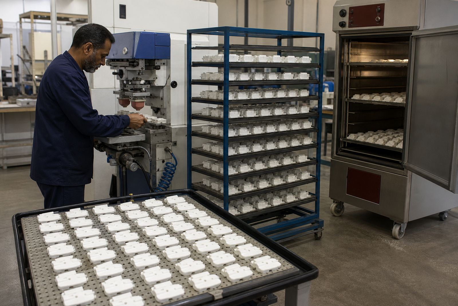
Pad printing is often chosen because it transfers ink from an etched plate using a silicone pad that can reach curves, recesses and tight faces. That flexibility helps, but it also means colour behaves differently on each substrate. A white mark on black plastic may be clear, while the same white on a pale grey housing may need adjustment to stay visible.
For manufacturers in Durban, Johannesburg or Cape Town, the first question should be simple: what must the mark achieve. Is it branding, identification, direction, or warning text. Once that is clear, the colour decision becomes far easier.
Start With Contrast, Not Preference
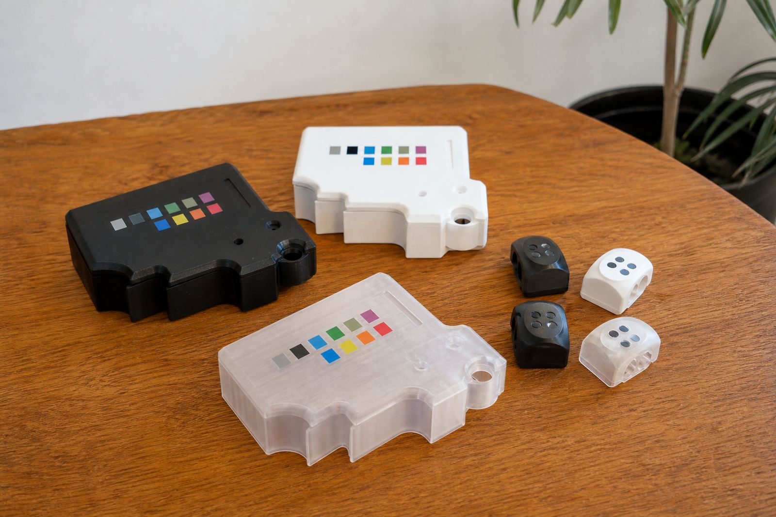
Many colour problems come from choosing what looks good on paper instead of what reads well on the part itself. Contrast is the main concern. A dark ink on a dark moulding can vanish after a few weeks of handling, while a pale ink on a bright or reflective surface can wash out under strong light.
In practice, the best choice is the one that stays legible from a normal working distance. That means checking the part under the kind of light used in the factory, warehouse or clinic, not only under a bench lamp. If the component will be inspected by operators in Pretoria or shipped to a customer in Gqeberha, the mark must still be clear after packing, storage and transit.
- Use high contrast for serials, caution marks and part references.
- Keep decorative logos slightly stronger than the background when possible.
- Avoid colours that sit too close to the substrate tone.
- Check the mark on the actual part, not only on a drawing.
Match the Ink to the Substrate
Different materials take ink in different ways. Some plastics accept a print cleanly, while others need careful surface prep or an adhesion test sample before full production. Metals, coated parts and textured housings can all behave differently too. That is why colour matching is never only a visual task. It has to work with the material and the curing method as well.
The ink used on medical and electronic parts must bond properly and dry or cure in the right manner for the job. Heat curing, air drying or a specialised curing method may be used depending on the component and throughput. If the colour looks right but the cure is incomplete, the print can smudge, wear or shift in appearance. The finish should suit handling, cleaning and the device maker’s own compliance requirements.
When a part is likely to be wiped, assembled, or packed soon after print, it is worth asking how much handling the mark will face before final use. A colour that works on one batch may need a minor adjustment on another because the moulding, coating or finish has changed.
Think About Readability in the Real World
Readability is not only about the ink colour. It also depends on line thickness, font choice, print area and the shape of the part. A thin grey line may look neat on screen but disappear on a curved housing. A bold mark may hold up better on a small switch plate or control shell. Where the part is tiny, the colour must support the artwork instead of fighting it.
In medical and electronic work, small marks often need to stay clear after repeated cleaning, light abrasion and general handling. That means avoiding colour combinations that rely on subtle shading. Solid, steady contrast usually performs better than a delicate effect. It also helps to keep the artwork simple where possible, because the cleaner the layout the easier it is to read.
- Use bold text for serial numbers and identifiers.
- Leave enough clear space around the print.
- Keep line work simple on curved or textured parts.
- Test the mark from the normal viewing angle.
Local Conditions Can Change the Finish
These conditions can affect how ink behaves before and after printing.
That is why practical colour selection goes hand in hand with process control. The team may need to adjust plate exposure, ink mix, drying time or fixture making to keep the print steady. If a job is being rerun, rerun job control matters as much as the original colour choice, because small changes can show up quickly on medical and electronic parts.
A recent example from a Westmead production run involved a dark housing for an electronic component with a pale marking. The first sample looked fine indoors, but under brighter inspection light the mark was a touch too soft. A small shift in tone and a cleaner print area planning step gave better legibility without changing the part itself.
A Practical Colour Approval Process
The safest way to choose print colours is to move in stages. Start with artwork preparation and logo redraws if needed, then plan the print area and agree on a realistic colour target. After that, trial sample runs and adhesion test samples help show whether the colour performs on the actual substrate. This is especially useful when a product has several variants or when the same print must work across different batches.
For manufacturers shipping across South Africa, a clear approval process saves time later. It reduces rework, keeps dispatch packing cleaner and avoids confusion when the same part is needed for Durban, Johannesburg, Cape Town, Pretoria or Gqeberha. A good approval process also helps the client stay in control of their own device compliance, because the print outcome is documented before production continues.
- Confirm the substrate and finish before choosing the colour.
- Approve a sample on the real part, not just on paper.
- Check curing behaviour and handling resistance.
- Record the agreed colour for future reruns.
When Colour Supports Function, Not Just Appearance
For PadPrinters Medical, colour choice is part of the working method, not a finishing extra. The right ink colour can improve part identification, reduce assembly errors and help a product present cleanly in a busy environment. On electronic components, a careful colour choice can separate labels from the body of the unit. On medical parts, it can help with clear, controlled marking where the surface is limited and the print must be precise.
That is why the best colour is often the one that performs quietly. It does not draw attention to itself. It simply stays readable, bonds properly and looks consistent from the first sample to the last dispatch. In practical terms, that is what manufacturers need when they are producing at scale and can not afford unnecessary rework.
When colour choice is handled properly, the print supports the part instead of competing with it. That is the standard worth aiming for on every job.